ggplot2 Tutorial: Components, Layers, and Examples
Nikhil Gopal, Graham Kim, Uba Backonja
January 25th, 2016
Goal of this presentation
What you need to follow along
The BP dataset
A peek into the data frame
Let's Summarize the BP dataset
Visualizing data in R using defaults
Visualizing data in R using defaults
plot(bp)

But then why ggplot2?
What is ggplot2?
What components underlie all graphics?
What we will cover today
BP in default graphics (again)
Let's focus in on logdose vs bloodp

Let's focus in on logdose vs bloodp
Deconstruction of a figure
Let's reconstruct using ggplot2
Let's reconstruct using ggplot2

Understanding the syntax
Layers
Layers
Let's pause and reflect for a moment
Let's modify our plot
Can anyone describe how they might tweak the previous code to create this plot?

Let's modify our plot
Let's modify our plot
Let's add color!
What do you see? Can anyone describe how they might create this plot? What would you need to add to the stub code and where would you add it?

Let's add color!
Color choices: RColorBrewer

Let's add size!
What do you see? Can anyone describe how they might create this plot?

Let's add size!
And shapes!
Do you remember anything tricky about shapes from previous lectures? What kind of scale is shape best used for? And what kind of scale do we have in our dataset?

And shapes!
And a quick linear regression line
Can anyone describe how they might create this plot? What do you see?

And a quick linear regression line
Titles and Labels
Always have titles and labels!

Titles and Labels
Can anyone describe how they might create this plot? What do you see?
Titles and Labels
Let's meditate on this for a second...
How might we make a histogram?

How might we make a histogram?
How might we add color?

Let's add some color!
Let's make one of those fancy coxcombs we see all over the Internet!
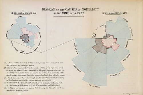
Let's make one of those fancy coxcombs we see all over the Internet!

Let's make one of those fancy coxcombs we see all over the Internet!
Which would you use, and when?
